Bright Vs Neutral Colors
Bright Vs Neutral Colors comparison guide. Detailed analysis to help you make the right choice for your iPhone Pocket.
What You'll Learn
- Black and Cinnamon work with everything
- Bright colors (Lemon, Mandarin, Pink) make statements
- Middle colors (Sapphire, Purple, Peacock) balance both
- Consider your existing wardrobe colors
- Professional settings favor neutrals
- Bright colors show dirt more easily
- Owning multiple colors provides flexibility
The color decision is personal, but there are practical considerations. Bright colors make statements, neutrals provide versatility. Here's how to choose.
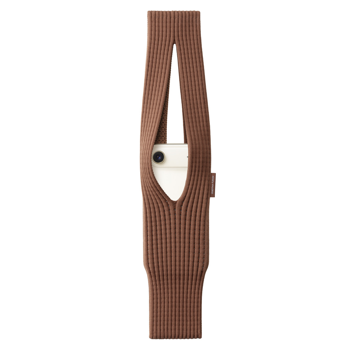
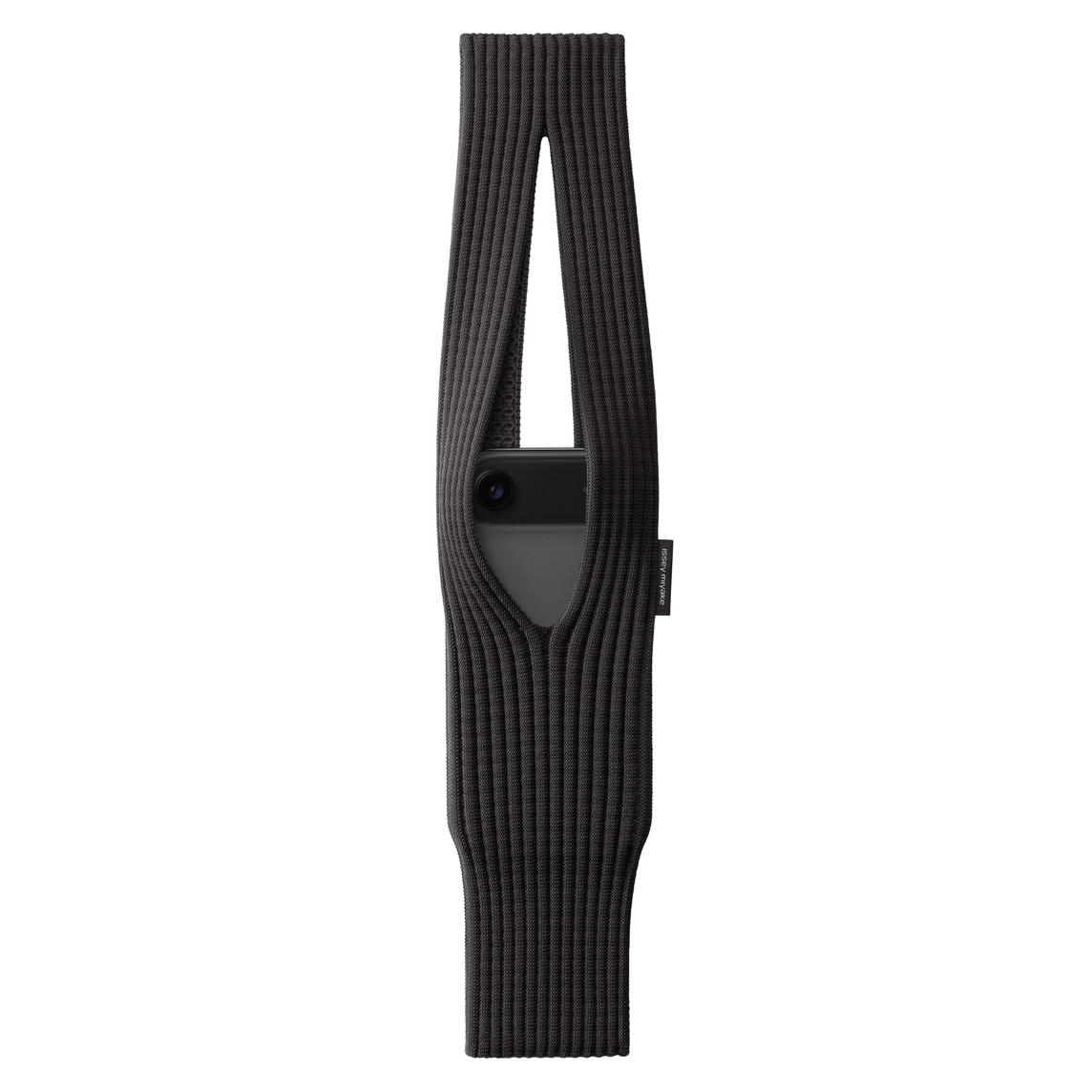
The Neutral Case: Black and Cinnamon
Comparing iPhone Pocket options
Black and Cinnamon work with everything. They're the jeans of iPhone Pockets—reliable, versatile, never wrong. Black is the safest choice: works in professional settings, hides dirt, pairs with any outfit. Cinnamon is the warm neutral: sophisticated, works with earth tones, feels seasonal without being limited to one season. If you're buying your first pocket and unsure about color, start with Black or Cinnamon.
The Bright Case: Lemon, Mandarin, Pink
Bright colors add personality and energy. Lemon is optimistic and summer-ready. Mandarin is bold and confident. Pink is playful and feminine. These colors work when you want your pocket to be a statement piece. They photograph beautifully, are easy to spot in bags or crowds, and add interest to simple outfits. The downside: they're more limiting—you can't wear them with everything, and they show dirt more easily.
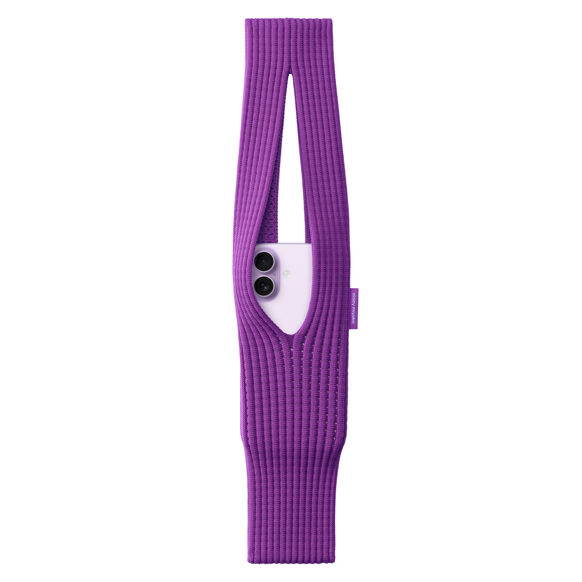
The Middle Ground: Sapphire, Purple, Peacock
Comparing iPhone Pocket options
These colors bridge neutral and bright. Sapphire is sophisticated blue—colorful but not loud. Purple adds richness without being too bold. Peacock (teal) is distinctive but versatile. These colors work in more situations than brights but add more personality than neutrals. They're the sweet spot for many users: interesting enough to be fun, versatile enough to be practical.
Wardrobe Integration
Consider your existing wardrobe. If you wear mostly neutrals (black, white, gray, navy), a bright pocket adds interest. If you wear lots of color and pattern, a neutral pocket provides balance. If your wardrobe has a color theme (lots of blues, lots of earth tones), choose a pocket that complements that palette. The pocket should enhance your style, not fight it.
Lifestyle Considerations
Your lifestyle affects color choice. Professional environments: stick with Black, Cinnamon, or Sapphire. Active lifestyles: darker colors hide dirt better. Social and creative fields: bright colors express personality. Parents and caregivers: neutrals hide inevitable stains. Travelers: bright colors are easy to spot, neutrals work in any cultural context. Match your color choice to your actual life, not aspirational life.
The Multiple Pocket Strategy
Many users solve the bright-vs-neutral dilemma by owning multiple pockets. Start with a neutral for everyday versatility. Add a bright for weekends and special occasions. This approach gives you options without commitment. The pockets are affordable enough that owning 2-3 colors is reasonable. You can match your pocket to your mood, outfit, or activity.
Resale and Longevity
If you care about resale value, neutrals hold value better. Black and Cinnamon have broader appeal. Bright colors are more personal—what you love, someone else might not. For longevity, neutrals show less wear and fading. Bright colors can fade with sun exposure over years. If you're buying one pocket to use for years, neutral is the safer long-term choice.
Conclusion
Neutrals provide versatility and longevity. Brights add personality and fun. Middle-ground colors offer the best of both. For your first pocket, choose based on your lifestyle: professional life favors neutrals, creative life allows brights. Or buy multiple and switch based on mood and occasion. There's no wrong choice—just different priorities.
Frequently Asked Questions
How does Bright Vs Neutral Colors work with iPhone Pocket?
The iPhone Pocket's 3D-knitted design makes it perfect for bright vs neutral colors. The expandable structure adapts to your needs while maintaining security and accessibility.
Which color is best for Bright Vs Neutral Colors?
Color choice depends on your personal style and use case. For bright vs neutral colors, consider both aesthetic preferences and practical factors like visibility and wear patterns.
Should I choose short or long strap for Bright Vs Neutral Colors?
Short straps ($149.95) offer compact portability, while long straps ($229.95) provide hands-free versatility. For bright vs neutral colors, consider how you typically carry your phone and what activities you'll be doing.
Related Articles
Ready to Shop?
Explore all 11 iPhone Pocket colors and find the perfect match for your needs.
View All Products